UX case study
Live chat console redesign

Company
SnapEngage
Role
UI/UX Director
Work
UX strategy // UI and product design // workshop facilitation // user research and testing // information architecture // quality control // marketing design // and more…
The challenge
SnapEngage is a scalable conversation platform that allows sales and customer service teams to engage, support, and convert their website visitors. The company boasts over 21K live chat agents and 60M conversations in 87 countries.
When I joined SnapEngage, the company had prodigious design debt and was entering an aggressive growth phase into the enterprise space. Customer retention became a pressing concern and we faced challenges with our core product so we shifted to more of a product-focus.
While the core product, an old chat console, was functional and worked well enough for many customers, we had abundant user feedback suggesting that their day-to-day work was inefficient.
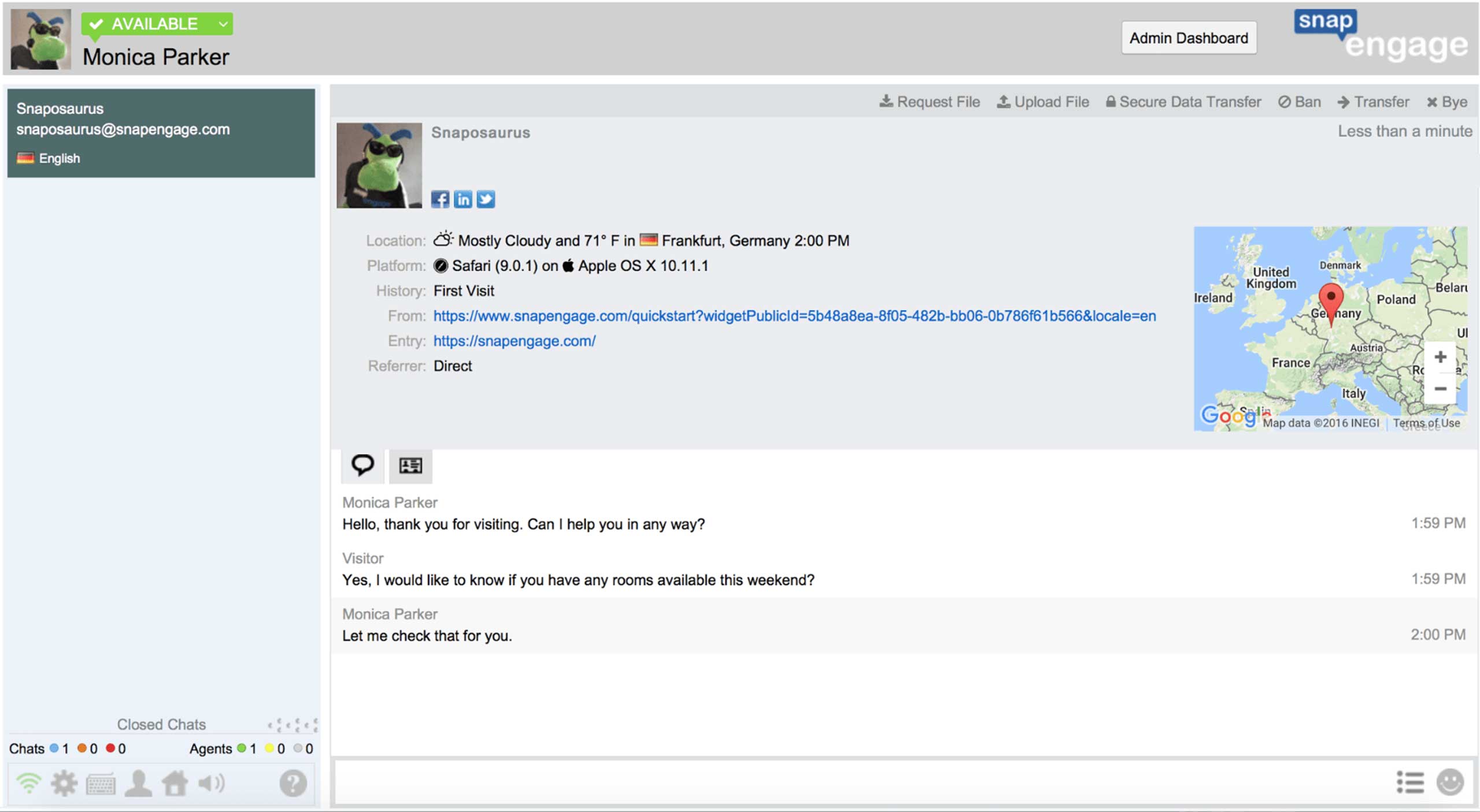
Out-of-date chat console UI
Further, the underlying front-end technology was out of date so adding or improving features was cumbersome, slowing us down just as we needed to be moving faster.
Our product was feeling dated. With design debt and tech debt, and painful user feedback, it was time for a major overhaul.
Design Burst
(or how to realistically condense a GV Design Sprint)
I led a team of stakeholders (CEO, CTO, engineering, marketing, etc.) in a Google Ventures style Design Sprint. The biggest challenge with a GV Design Sprint is that it requires locking a group of expensive executives and customers in a room for a week. “Sorry, team. You can’t do your normal job while we’re working on this project.” That’s just too big of an ask for nearly any organization. Necessity drove innovation. I managed to condense Monday-Wednesday of the Design Sprint into a single day that I call a ‘Design Burst’.
Here’s the flow:
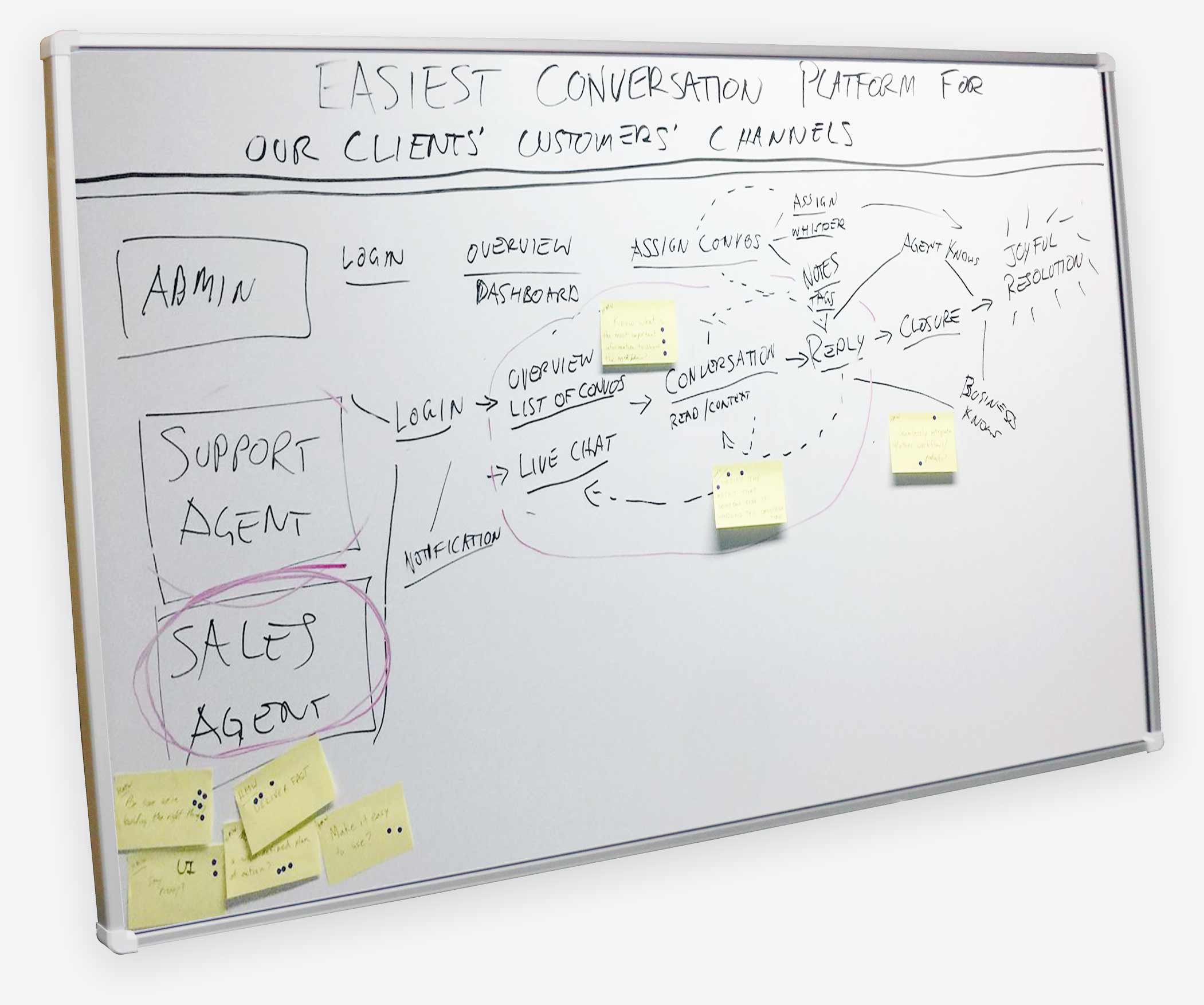
Mind map // vision with “How Might We?” stickies
1. Set a long term goal: get optimistic about the FUTURE
Design the most friendly text-based conversation platform.
2. List challenges: get pessimistic about the FUTURE
What could make the project fail? Reliance on 3rd party infrastructure? Alien invasion?
3. Make a map: the PRESENT
Identify users (we settled on Sales Agents). Map out the user journey from login to “joyful resolution” of a conversation.
4. ‘How Might We’ notes
Propose potential solutions to the challenges identified previously.
5. Pizza and lightning demos
Keep the team fed and review what similar products do to solve similar problems.
6. Pick a target
This will be where we focus our design efforts.
7. Sketch
‘Crazy-8s’ speed sketching to quickly get some ideas, followed by everyone’s fancy solution sketches.
8. Sticky decisions
Put the drawings up on the wall like an art museum. Then go to town with sticky dots on the drawings to build a heat map of the most interesting ideas. Speed critique and then super vote with big sticky dots. Settle on the winning design(s).
9. Storyboard it
Map out the user flow using sketches of the final screens.
Note: in my Design Burst methodology, the remainder of the GV Design Sprint is handled by my design and research team without involving stakeholders.
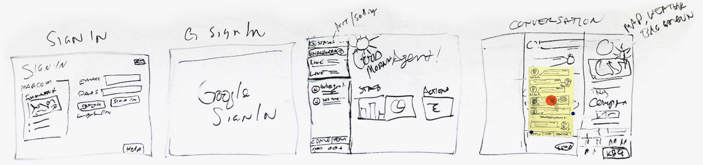
The winning sketches

User flow // storyboard
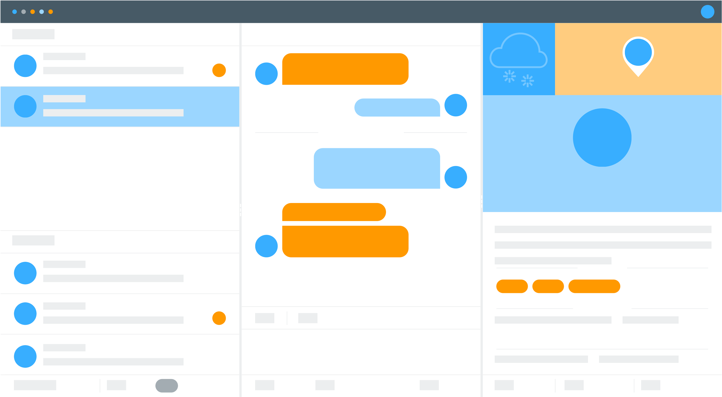
UI wireframe
A clean wireframe of the winning design.
Note: I also led a brand refresh around this time, bringing new colors to the UI.
High-fidelity mockups
At last, it was time to push some pixels and design mockups to put into prototypes for user testing.
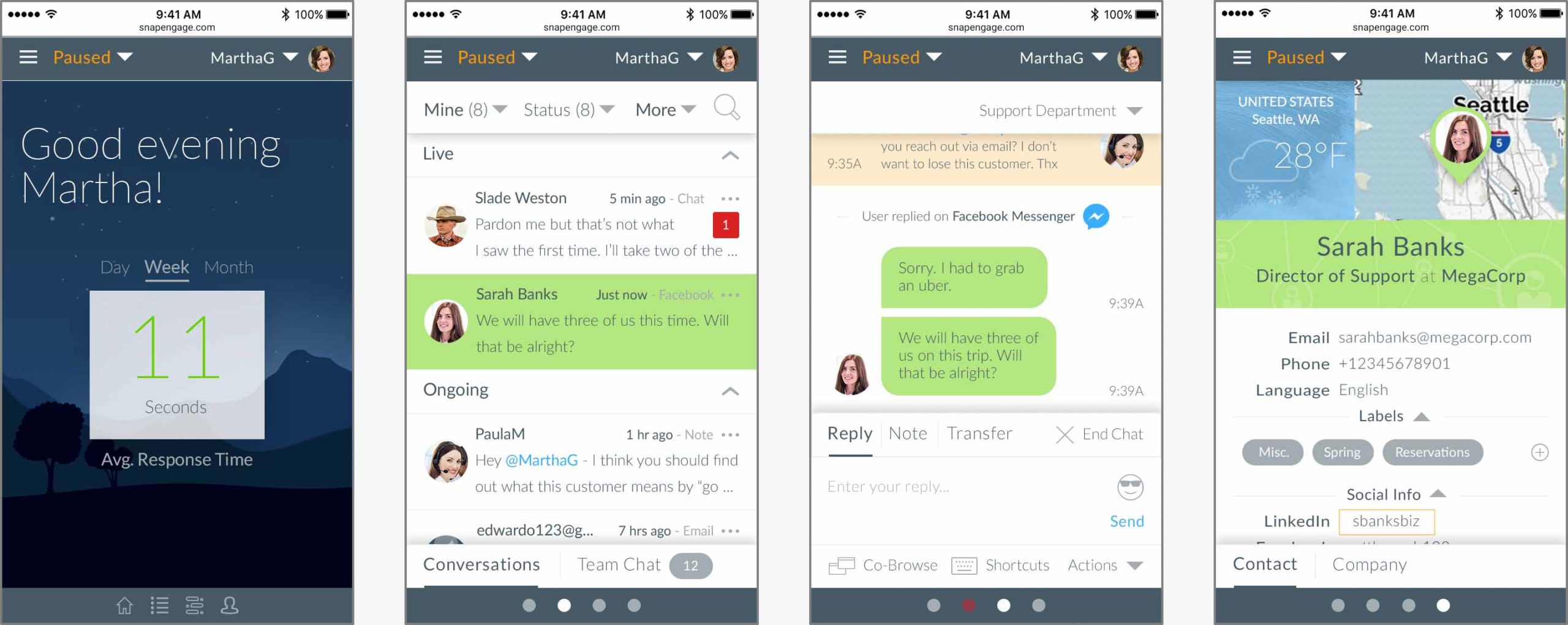
Usability testing
Once we had high-fidelity mockups designed, we assembled prototypes in InVisionApp to test with real users. I had an intern run the usability tests so she could gain some experience. As part of the test script, we asked participants to rate ease-of-use on a scale of 1-5 to help us convert qualitative experience into quantitative numbers to highlight areas that needed improvement.
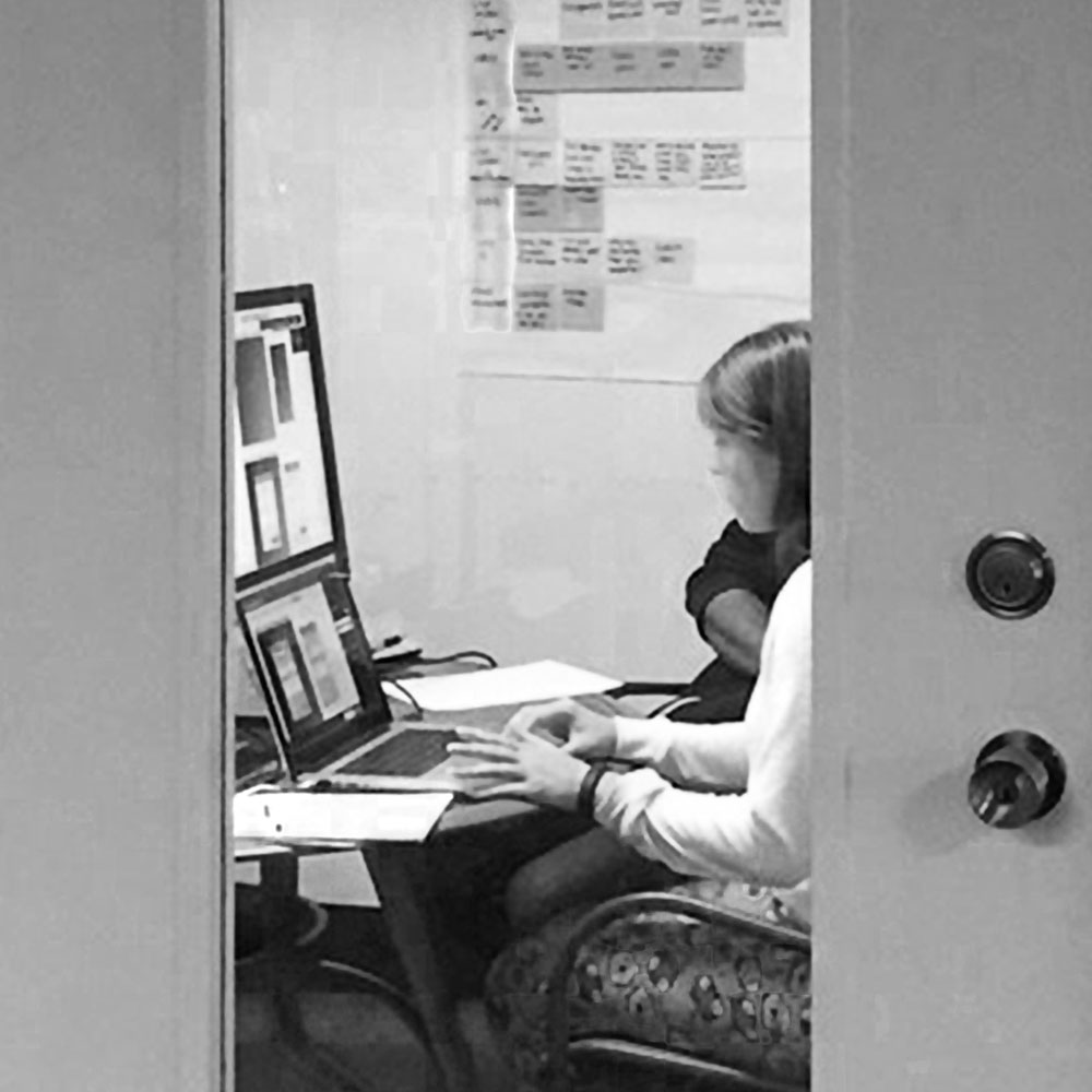
A user tests a prototype while stakeholders observe via screenshare in another room
- Reply to chat 100%
- Shortcuts 92%
- Upload file 80%
- End chat 100%
- Filter chats 64%
- Request file 100%
- Transfer chat 92%
- Knowledge base lookup 56%
What we learned
The UI colors are too ‘bright’
Chat agents stare at their screens for hours on end, every day. Depending on how different monitors were calibrated, the colors we chose for the UI were oversaturated. And the UI, overall, was a bit hard on the eyes. As a result, we reduced the color saturation a bit and added ‘dark mode’ to the product backlog.
Before
After
Our chat filter was not necessary
In testing, we discovered that users did not understand the chat filtering UI. It turned out that the mental model of chat agents did not include a way to differentiate different chats the way we had anticipated: filter by channel (Facebook, SMS, live chat, etc.) or by subject tag. We did not have a way to implement tags yet and users just wanted to see all chats, regardless of channel. Easy fix: eliminate chat filtering. Upon beta launch, we did not receive any feedback requesting chat filtering, though we did confirm that users wanted the ability to tag chats.
Knowledge base lookup was not intuitive and efficient
Users had difficulty knowing how to look up answers in their knowledge base. They did not even necessarily know that they had a database integration. Exposing this feature became important. Further, once discovered, the knowledge base lookup required two more clicks than necessary. The design for that feature was simply not fully baked when we tested. More proof that it’s important to have all your ducks lined up when testing with real users.
Engineering and beta launch
Finally, after much design and product spec tweaking, it was time to let the engineers go to town. All the up-front work on design and validation reduced engineering waste, giving them focus to build the right thing.
Throughout development, I was involved in validating work, ensuring that the team could build the thing right.
Then we launched! We gave users the option to try the beta along with a way to go back to the old interface. We provided a feedback mechanism to capture any reasons users had to go back to the old system. And we did even more user research with customers, reaching out to the most vocal to dig into their experience.
What we learned
Quant data doesn’t always tell the whole story
As part of the redesign, we decided to simplify things by hiding a team chat feature (similar to Slack) under a ‘tab’ in the left column. Afterall, usage data showed that around 6% of our customers used the team chat feature, so why take up valuable real estate with such a little-used feature? The concept of ‘information hiding’ or ‘progressive disclosure’ is often used in UX to simplify user interfaces. But it is often at the cost of discoverability, adding a click to get in and out of a feature.
However, for those customers who did use it, moving the team chat layer back actually caused major usability headaches. When agents were in team chat, they would miss incoming live chats (despite plenty of affordances via notifications, sound, and animated browser tabs, etc.). Thanks to qualitative feedback, we decided to expose the feature once again.
Mobile first became mobile last
We took a bet on whether or not customers would want a mobile version of the new chat console UI. The old one was not built for mobile. Would chat agents expect mobile? During the early research phase, our customer interviews did not indicate that they would, but from a design standpoint, I felt it was important to ensure the possibility that the UI could work nicely on mobile.
Even though we designed it to be responsive and mobile-friendly (a challenge in itself for enterprise software), we confirmed in the beta that customers really did not want nor need a mobile version of the interface. Engineering took that feedback to heart as a strong argument against building out the app in a mobile-friendly way, post-beta. It was enterprise software and the support and sales agents who use SnapEngage software were using it from their desk. There was little reason to make this thing mobile-ready.
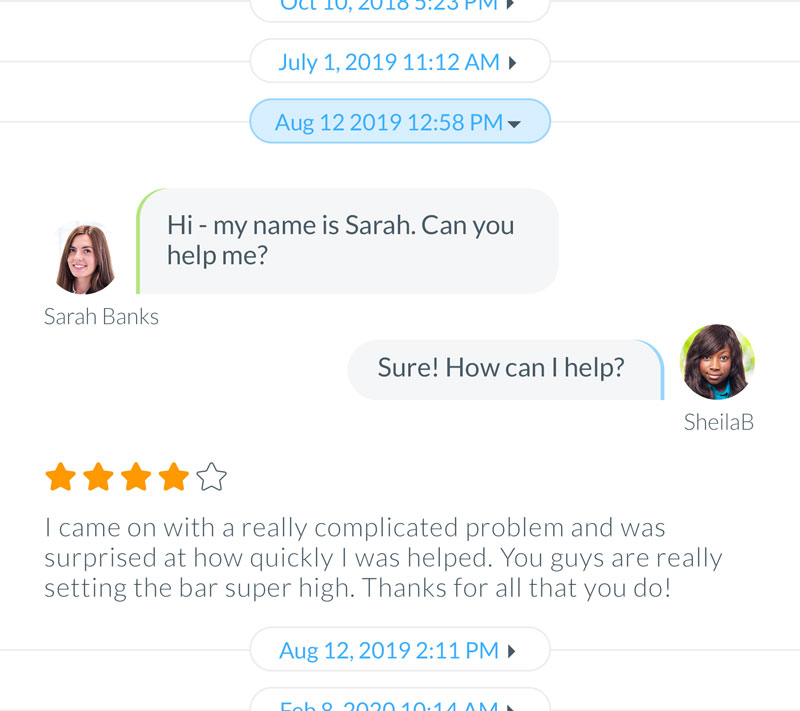
Customers wanted a way to see chat history
Our system kept track of previous chats with website visitors. Our interface simply provided links to the old chats. But after the beta was launched, it became clear that it would be a much better UX to provide the previous conversations in the transcript area above the current chat.
Success!
My UX strategy approach supported the company vision to a successful end. Using my ‘Design Burst’ methodology, I was able to facilitate cross-team collaboration, establishing alignment among stakeholders. User testing and validation were instrumental in proving out the design, making the development process efficient and saving our teams’ resources. This was particularly true for the engineering team that did not have to waste cycles building functionality that had not been validated. The biggest win was seeing all the positive customer feedback when we launched. Yessss!

Our global base of POPerations is in Boulder, Colorado, USA ⛰️